"Mr. Zombie" is actually a term of endearment I coined for the lovely standard zombie. He spends all of his evenings trying to trudge past an unforgiving army of treacherous plants, being pelted with golfball-sized peas and getting his head cracked open by massive watermelons. And when he finally evades the shower of projectiles and slips past the stinky garlic, the savory scent of used brain filling the air, he gets run over by an automated lawn mower. Armed with a handful of decaying teeth and an unwavering determination, he skillfully manages to destroy an entire lane of ceramic pots and sunflowers, decapitate a sinister piece of corn, and crunch his was through an entire morbidly obese wall-nut --- only to be run over by a lawn mower? Seriously, The least anyone could do is pay him a bit of respect for his unsuccessful ventures. He works hard and never prospers, and don't even get me started on the pay blocks and questionable lack of health benefits. I feel mildly disappointed, perhaps even a bit ashamed, every night when Mr. Zombie slides through the door, undoes his tie and cradles his head in his arms, sobbing uncontrollably, while listening to Frank Sinatra on vinyl. No grown dead man should ever be put through such relentless suffering.
So please, next time you're sitting around with your lady friends, sipping on slightly fermented wine and bragging about what an incredible horticulturist you are, remember Mr. Zombie. Remember Mr. Zombie's lifeless body being mercilessly mangled by your unforgivable sin: planting a bunch of peas on your lawn.
Now, back to business.
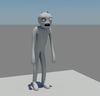
Here's my current progress with Mr. Zombie's 3D model:

I usually prefer to make production quality renders when working on more complex figures, as it gives a much clearer picture towards the finished model. In this case, Mr. Zombie was rendered with Mental Ray using Final Gathering and Global Illumination. The default sky lighting rig was used without any modifications, creating a nice, smooth fill that reflects nicely and casts soft, appropriately-opaque shadows. The material is the Mental Ray-specific "mia_material_x_passes", with a deep surface shader applied to areas light wouldn't necessarily radiate (inside the mouth, the nostrils, his pupils, etc.). This type of render setup is best comparable to clay - the environment and all objects appear soft and slightly malleable, and depending on the material settings, lose most of their glossiness and reflectivity. For this particular material, I've turned the glossiness down to about .15 and the reflectivity to .14, resulting in an ever smoother, tacky appearance.
As you can tell, this is far from finished. Why, Mr. Zombie appears to be naked! (Though I'm absolutely certain no one is complaining about that). But as this is a continuous work in progress - and we're here to discuss character construction and explore modeling approaches - no WIP image can go unposted!
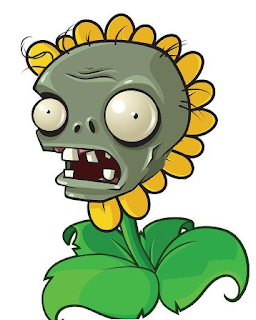
Let's start off with the reference image I used while creating Mr. Zombie.

It's a bit of an unusual mashup - Mr. Zombie's head posted on sunflower's body, seemingly a Photoshop alteration. Either that, or Mr. Zombie had a long standing affair with Ms. Sunflower and she consequently gave birth to a deformed, vile contradiction that only your hairy aunt Bertha would love. Regardless of its origins, I chose this image for two reasons: 1) It gives us a solid reference for his face, displaying specific features with adequate detail, and 2) This is literally the only official angle you can find of Mr. Zombie's face. Okay, there's one more image, but he's drawn in a manner that looks nothing like this construction. But really, did the graphic artist at PopCap get fired or something before he could draw more than one image of Mr. Zombie? I've scoured the web, and every single official PopCap-created image of Mr. Zombie feature this same exact face, just modified to suit the situation (toss a bucket on his head but use the same face image, toss a cone on his head but use the same face image, make him a dancing zombie by outfitting him in a laughably puny afro and gold bling your dog would kill for, but use the same face image). Either that or he's a distant relative of
2D Face Girl.
Looking at the image, we can pick up on a few details. First off, we notice that his design actually somewhat defies symmetry: his eyeballs, as well as his nostrils, are slightly smaller on the right, the wrinkles on his forehead curve to different degrees depending on what side of the seam it lies on, the slim, black strands of hair spotting his bulbous noggin aren't placed in any particular fashion, and don't even get me started on that plaque party going on in his mouth. Asymmetrical models, though requiring additional steps, generally don't pose much of an obstruction to the modelling process. Once we're finished modeling the character in its entirety, we can remove any symmetry and begin modifying and adding verts to break up the symmetry and match the reference images. This is why the above render is still completely symmetrical - we haven't yet reached a point where we can mirror the geometry and edit each side separately.
Next, we'll want to focus on the some of the major facial landmarks, certain features that serve as focal points or may demand a more precise topology. When considering the construction of your character's face, or any portion of your character for that matter, it's helpful to imagine where loops of polygons would best sit to ensure a smooth, continuous surface without any jarring aesthetic interruptions (unless, of course, it's intentional). There's no single answer for deciding where to put the edge loops, or even specifically how each should flow, but after 3D modeling for some time and visualizing the surface direction of your character, you'll gain a greater understanding of the topology construction. Thankfully, there
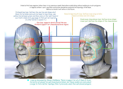
are, however, some fundamental guidelines you may want to follow that are generally universal for all character faces - human or anthropomorphic. Take a look at this image:

I'd credit the original author of this image, but it's currently unknown. As you can see by the note at the bottom, the edgeloops were influenced by Steven Stahlberg's discussion on facial topology. He does some incredible work by the way! The colored edgeloops indicated in this diagram serve as the basic topology you'll find on just about any head. Their purpose, besides creating a smooth, flowing surface, is to ensure that all movable features will deform correctly when it comes time to animate. If the edgeloops properly follow the facial muscle contours, they'll also deform realistically as muscles do. Of course, all of this is a bit of a generalized statement - it's not necessarily as easy as tossing in a bunch of edgeloops and calling it a day. Depending on your character's complexity, he may have numerous edgeloops in the most bizarre locations, crossing each other and breaking off at any given point. It's an exercise of managing multiple edgeloops, accommodating their flow to the surface characteristics of your model, and ensuring that everything is continuous, even, and meaningfully contributes to the overall topology.

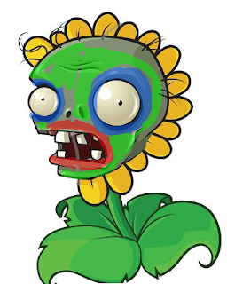
What is this monstrosity, you ask? Did Mr. Zombie finally crack and decide to pursue his lifelong dream of becoming a clown-zombie-sunflower hybrid? Though I occasionally coax him into getting out the old magician's hat (you should see his "eyeball-pop-out-of-the-socket" bit, pure genius!), this image is actually a preliminary diagram of Mr. Zombie's facial topology. In Photoshop, I created a new layer above the reference image, turned down the opacity slightly, and begin marking out some basic edgeloops to keep in mind during the modeling phase. Like I mentioned before, it's always great practice to have a solid diagram of topology intents, despite how ridiculously (sexy) it makes Mr. Zombie appear. With this approach, you can lay down the foundation of your model easily, and work in the finer details and inbetweens as you go along.
I recommend planning out the general topology before you begin, but some people prefer to have it almost completely solidified on their diagram before they even place one vertex in their scene. A very talented 3D artist by the name of Eric Maslowski literally draws just about every single face over his reference image before moving to 3DS Max. Sometimes a bit of a tedious process, especially considering you're working in a flat 2D space which makes it a bit more difficult to visualize a 3D representation, but believe me - it
does have its benefits. Since you're establishing all of the groundwork before hand, reconstructing it in 3D should be a breeze. It becomes a matter of simply rearranging the vertices upon one axis, instead of three. Also, you'll encounter any hiccups in your topology before you bring it into your 3D modeling program, and it's undoubtedly much easier to change something on paper than it is on a massively humungous 10K polygon model. Check out his free video series tutorial
here, it definitely jump started my edgeloop and topology understandings.
You can construct your model in multiple ways, the most popular being box modeling, patch modeling, and NURBS modeling. Box modeling is, as the title suggests, beginning with a polygon box and cutting edgeloops, adding vertices, extruding, shaping, and tweaking until you reach your finished model. Although the word 'box' is right in the title, it's more of a loosely termed technique; you can box model beginning with a sphere, a rhombus, a triangle, or any other shape you can imagine. The technique is more described as starting with any given polygon object, and cutting, modifying, and refining it into something else, and is usually comparable to starting with a slab of clay and adding detail. Box modeling is suited for both organic and inorganic objects. Patch modeling (also commonly referred to as edge modeling and point modeling) is beginning with one polygon, or a set of flat polygons, and extruding the edges while merging vertices, cutting any additional edges, and shaping the faces. This differs from box modeling in the manner that patch modeling usually requires you to have a topology plan in mind beforehand - since you're building detail from the ground up with every single extrusion, you'll need to have a plan of where each face sits.
I often like to adhere to the analogy of sketching vs. finished drawing to describe the differences between box modeling and patch modeling. Say you're attempting to draw a portrait of a young lady in a forest. If you took the box modeling approach, you'd block out all of the trees first, and the figure, sketch the ground, do some very simple shading, and after the gestures are done, you then go in and refine and add all the little details. If you took the patch modeling approach, you'd work the details in as you go and not bother with a preliminary sketch - perhaps starting with the lady, refining her face very carefully, then making your way to the trees, drawing each leaf, and then to the ground, carefully shading every minute detail as you work your way across the canvas. The benefits of box modeling is being able to have the groundwork established and only needing to work in the finger details - your boundaries are already defined, and you know the area to work within. Patch modeling has the advantage of establishing the detail early on during the modeling phase, so you know exactly what needs to be adjusted as you go along. So which is better?
Both play well in different situations, but at the end of the day, it's just purely the preference of the artist as to which technique to use. Personally, I always use patch modeling for heads, as they require a fine level of detail and I like to see the topology being constructed from the ground up so I know everything plays nicely together. For bodies, I generally use box modeling - it's a quicker approach, and I like to have the solid figure blocked out before doing any detailed refinements. For inorganic objects, such as tables and desks and machinery, I always jump to box modeling. It helps with ensuring the object has a solid, sharp feel, and it can be a major time saver for larger objects.
How about NURBS? NURBs - Non Uniform Rational B Splines - work well in their own category. While box modeling and patch modeling could be compared to raster graphics, NURBs could be considered closer to vector. Depending on the situation, it lends for extremely smooth, flowing surfaces, and it works well in areas that other modeling techniques might struggle. Eyeballs, though completely possible with polygons, can benefit from the smoothness of NURBs. The drawback though (and of course, there always has to be one) is that NURBs aren't necessarily as friendly or easily editable as their polygon counterparts. A different set of tools is required to do modifications to NURBs, and depending on what you're attempting, things could seem slightly confusing. Rather than editing individual polygons, you'll be working with control points, which are more like reference points indicating where the NURBs surface should flow next. Truthfully, to knock down my seemingly (hopefully) knowledgeable foray into 3D animation, I'm not all that well versed in the abilities of NURBs. I've used them, but not extensively enough to give you the greatest benefits and list a series of situations where NURBs would be more suitable. If you take just a few moments and Google "NURBs", you'll find a plethora of information.
Now I must redeem myself for my confession.
There's a lot of information to be taken in in this blog post, so be a sponge, my brethren, and expand your minds with the words I have spoken! But not like Spongebob - that guy's a jerk. Didn't even hold the elevator for me. In the next blog post, we'll be discussing some techniques for adjusting vertices to ensure the surface retains a smooth appearance. We'll also talk about methods of translating your character's proportions into three dimensions. Until next time, keep it classy, keep it sassy.
-Jon


